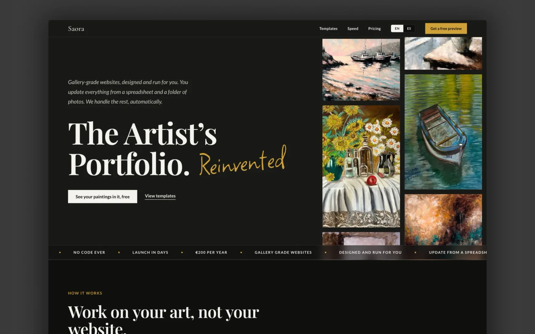
The problem, the decisions behind it, and where it’s going:
The problem
Artists need somewhere to show their work online, and none of the usual options work well for them:
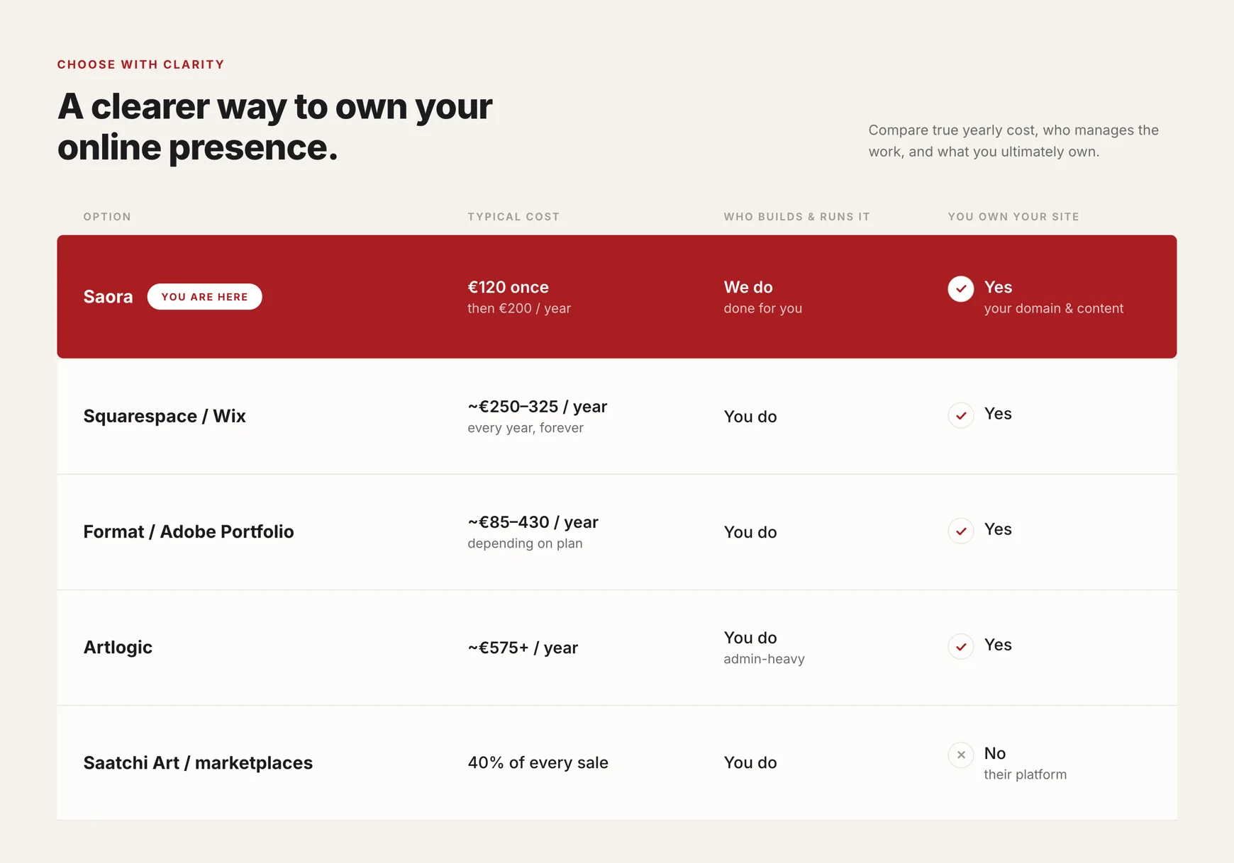
- Squarespace / Wix: the templates all look the same, and updating anything still means learning their editor.
- WordPress: plugins, updates, security patches, hosting bills. Something breaks every six months.
- Off-the-shelf Webflow templates: cheaper up front, but Webflow is a design tool. You have to learn it to change anything meaningful.
- A custom site from a developer: fixes the design problem, but starts around €2,000 and the artist still can’t update it.
There’s a second problem underneath that one. An artist’s site is never finished. It has to grow with the work: new pieces, new series, new categories. With every option above, adding a new painting means emailing a developer or losing a Sunday to Webflow.
Why me
I’ve spent nearly 10 years designing and building websites, six of them at eBay. I’ve also sat on the other side of this, trying to put a portfolio together with tools that felt built for someone else’s job. Saora is the product I’d want if I were an artist today.
Who Saora is for
A narrow audience, on purpose:
- Working artists with a body of work who need somewhere to show it.
- Students starting to build a public presence.
- Long-time practitioners and enthusiasts who want a proper home for their work without hiring an agency.
What they have in common: they want to make art, not websites, and they have no interest in learning web design.
Decision 1: No web design, not easier web design
The usual response to “artists find websites hard” is to make the tools easier. I think that misses the point. Artists don’t want an easier web design tool. They don’t want one at all.
So Saora works the other way round from most template products. I make almost every design decision myself: layout, typography, spacing, motion, image treatment. The artist gets a small set of controls that change how their work sits in the room. Background colour. Fonts. Text colour. A choice of layout. Everything else is locked.
The cost is flexibility. In exchange, the site can’t be broken or over-designed, and nothing the artist does can make it look worse than the work it’s showing.
To make that choice concrete, every preview ships with a small live editor. The artist tries a handful of curated font pairings and colour palettes, named and safe, directly on their own work. No font pickers, no hex codes, no way to make it look worse. They settle on a look, share a link to it, and that link is the exact setting I deploy.
Decision 2: A spreadsheet and a folder as the first interface
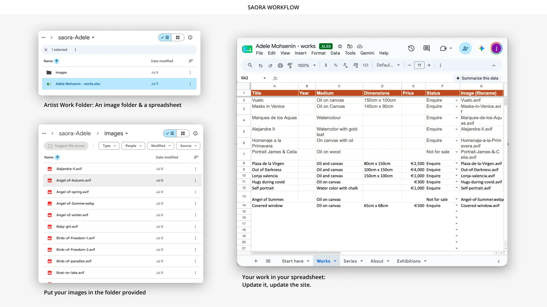
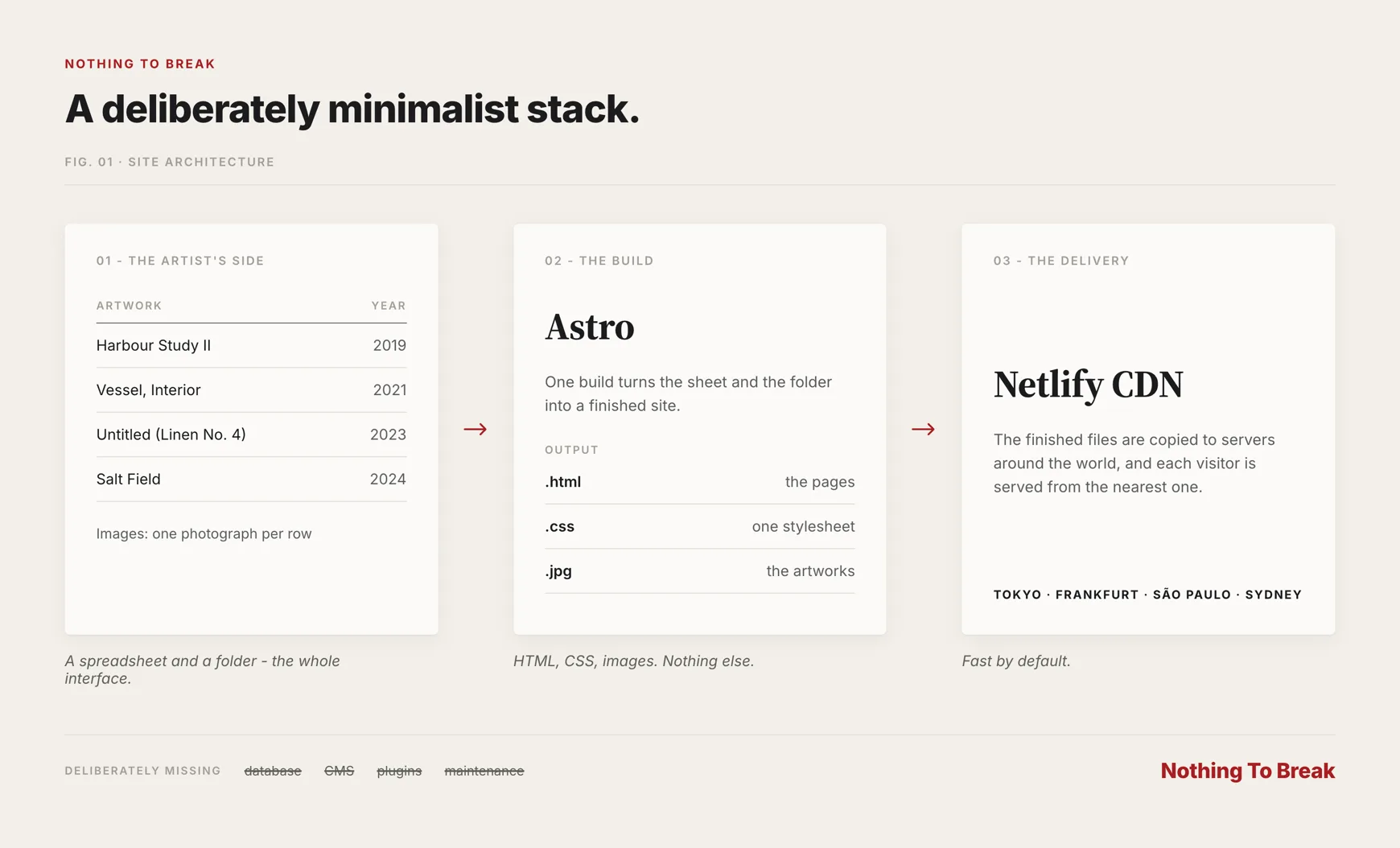
Instead of building a CMS, the first version of Saora used tools artists already knew. A Google Sheet held the pieces (title, description, dimensions, series). A folder held the images. To add a new painting, the artist added a row and a file, and I redeployed the site. There was no login and nothing to learn.
It was the right way to start:
- For the artist, there was nothing new to remember. Everyone knows spreadsheets and folders.
- For Saora, there was no CMS to build, no accounts, no database, and no hosting spend eating into the price. I could launch with one client instead of building for fifty.
It was enough to launch the first site and prove the service. It also showed me where a spreadsheet falls short, which is what led to Saora Studio, further down.
Decision 3: Templates that stay behind the work
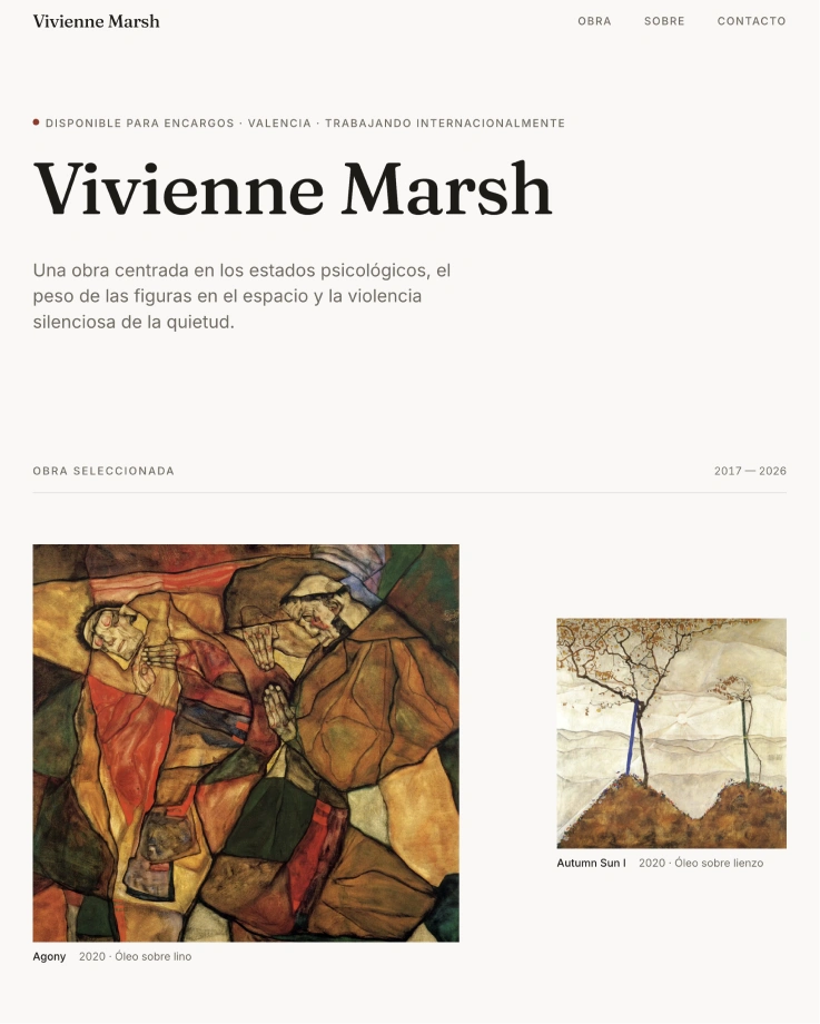
Four templates so far, each matching a different way artists think about their catalogue:
- Editorial: long-form and story-first. Works read like a magazine feature.
- Gallery: grid-first, minimal chrome. The work speaks for itself.
- Collection: categorised bodies of work with their own series pages. This one came out of my first client’s request.
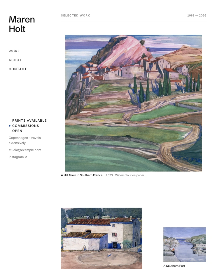
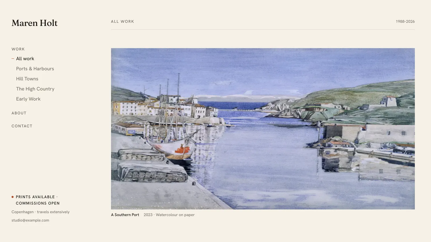
- Folio: light and quiet, with every series listed in a side menu, one click away. For artists with many bodies of work.
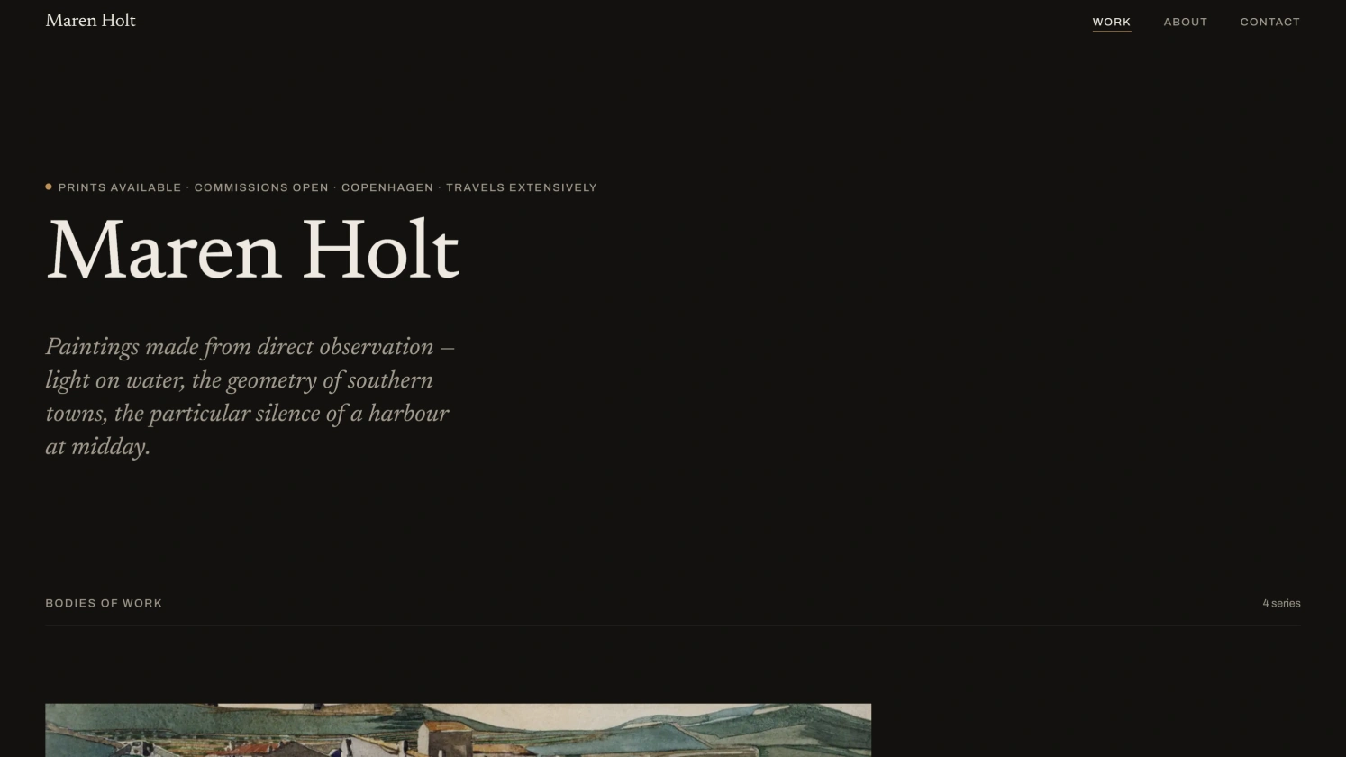
The design brief for all four is the same: the template is the frame, not the painting. Typography sits beside the work instead of competing with it. Motion only appears where it’s useful, like a piece morphing from the grid into its detail page. And images get particular care in how they’re sized, compressed and presented, because on most page builders they’re treated as generic content, and it shows.
Decision 4: One design system behind every site
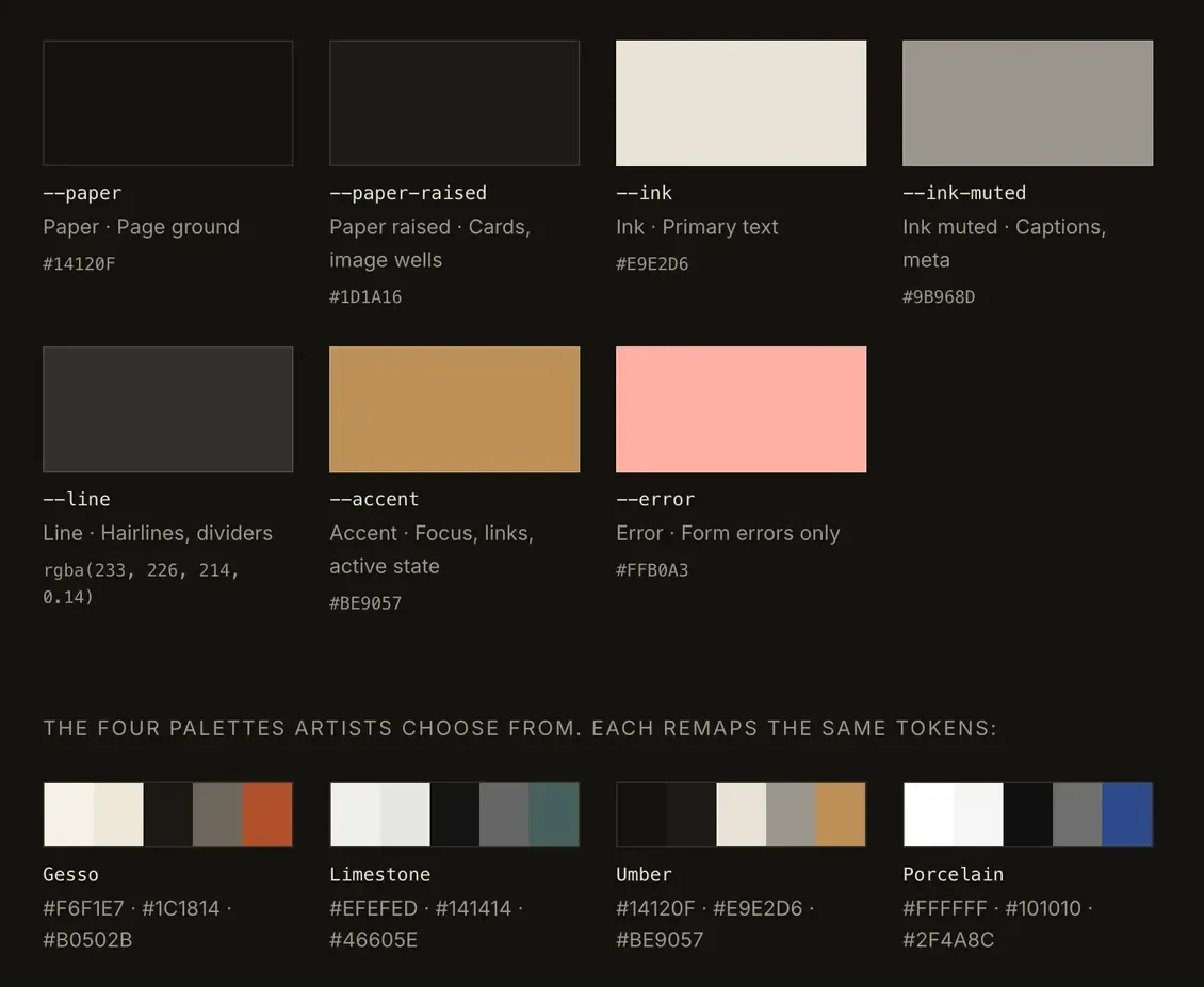
With four type pairings and four palettes across every template, there are dozens of possible looks, all built from the same code. A colour or font hard-coded in one component would break a combination nobody was looking at. So every site runs on one small design system, and it’s what lets a fix land on every site at once.
- Tokens, not colours. Components only use seven semantic names: paper, raised paper, ink, muted ink, line, accent and error. A palette is just a new set of values for those names, so adding a look never means touching a component.
- Every combination is checked. Contrast is measured against WCAG for every text pairing in every palette, and the lowest is 4.55:1. When one palette’s muted grey fell just short on cards, I darkened it rather than allow an exception.
- Documentation that can’t drift. The design system page is built from the same tokens and components as the sites. Type sizes are read from the stylesheet, contrast is measured as the page renders, and switching the palette restyles the whole page. It’s a view of the system, not a copy that slowly goes out of date.
- The artist’s words are part of it. Works, series, enquire, price on application. Never products, collections or buy now.
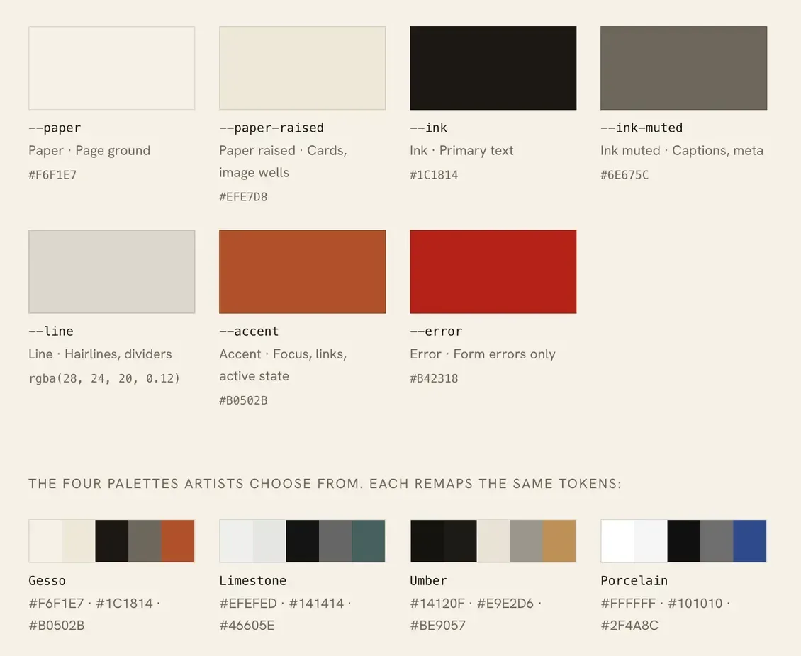
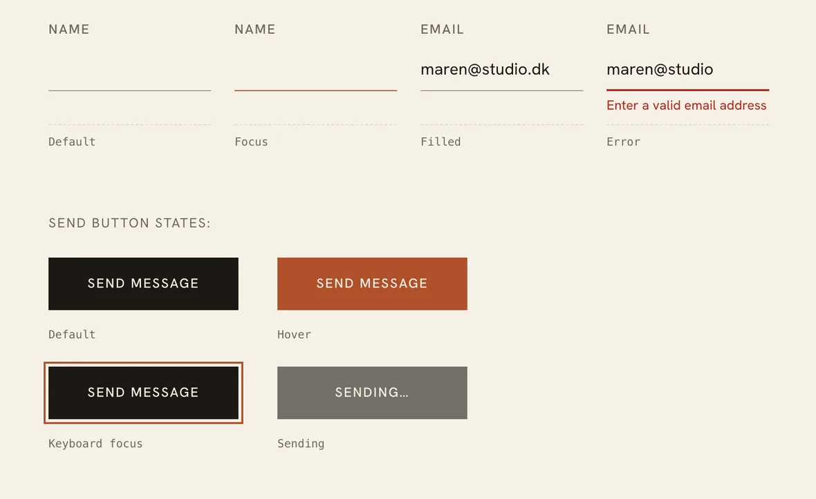
Documenting every state paid for itself. Laying out the contact form’s default, focus, filled and error states side by side showed that an error and keyboard focus looked almost the same, so errors got their own colour and a heavier underline. Testing those states for real then turned up a bug: the page router was sending the form before validation ran, so empty enquiries could reach the artist’s inbox and visitors never saw a confirmation. One fix in the shared form, one rebuild, and every artist’s site had it.
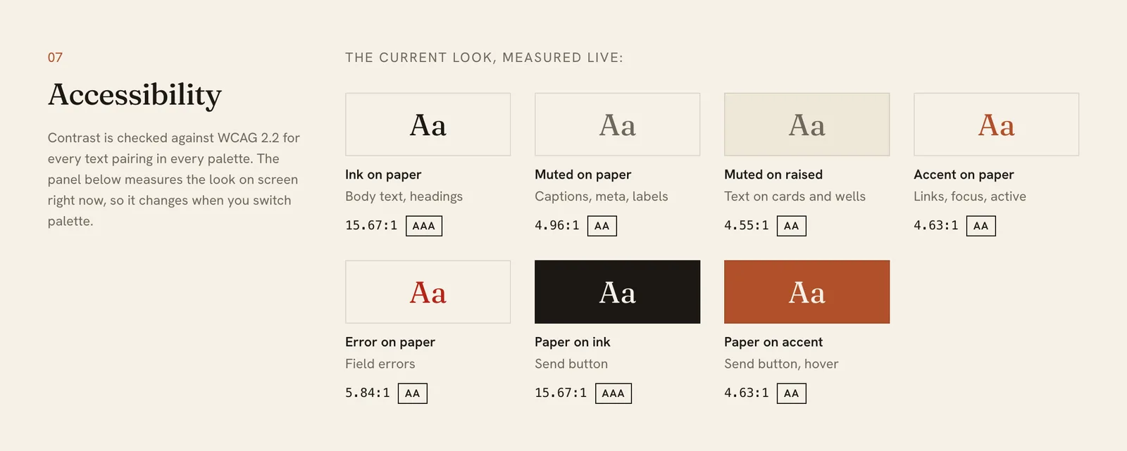
See the live design system. Switch the palette in the Personalise panel and the whole page restyles itself, contrast checks included.
Decision 5: A boring, static stack on purpose
Saora’s pitch is that the sites are fast, secure, cheap to run and never break. The tech has to actually hold that up, so the marketing site, the artist sites and the Studio are all deliberately boring:
- saora.co: static HTML pages with inline CSS and vanilla JavaScript. Netlify hosts it and Netlify Forms handles enquiries. No backend at all.
- The artist sites: one Astro codebase builds every artist’s site. Each site is a small settings file (name, layout, language, colours) plus the works the artist has published. Everything compiles to plain HTML, CSS and JS at build time, so a fix to the codebase lands on every site at once. Astro’s image pipeline turns a 2.5 MB JPG into a ~150 KB WebP with responsive variants. The lightbox is a native <dialog>. Fonts are self-hosted variable fonts. GSAP handles scroll reveals, Lenis smooths the scroll, and Astro View Transitions handle the morph from grid to detail.
- Saora Studio: a static app with a handful of Netlify Functions behind it. Works and photos are stored in Netlify Blobs. Pressing Publish triggers a build of that artist’s site, and it’s live in about a minute.
Every one of these choices is also a business decision. The only moving part is the Studio’s small back end, and at this size it costs almost nothing. The sites themselves have no CMS and no plugins, so there are no security updates to chase. One codebase means nothing to maintain per client. Static files on a CDN cost almost nothing to serve. That’s what makes the €200 a year price work.
Keeping the speed claim honest
Fast is part of the pitch, so saora.co has to hold itself to the same standard as the client sites. An audit in August 2026 caught it drifting: the marketing site has no build pipeline, and full-size JPEGs added to the hero collage had quietly pushed the initial payload past 2 MB. One optimisation pass fixed it:
- PageSpeed mobile 53 to 80, desktop 96
- Initial payload 2,041 KB down to 497 KB, a 76% cut
- Largest Contentful Paint 7.0s to 3.3s, layout shift 0.349 to 0.003
The fixes were deliberately unglamorous: WebP at display size, explicit dimensions on all 26 images so nothing shifts as the page loads, lazy-loading below the fold, and six self-hosted, preloaded font files with metric-matched fallbacks so the text doesn’t jump when they arrive. The remaining mobile gap is a trade I chose to keep. The hero’s slow-moving ribbon of artwork means the page never sits perfectly still for the scoring tool, and it earns its cost.
The first client
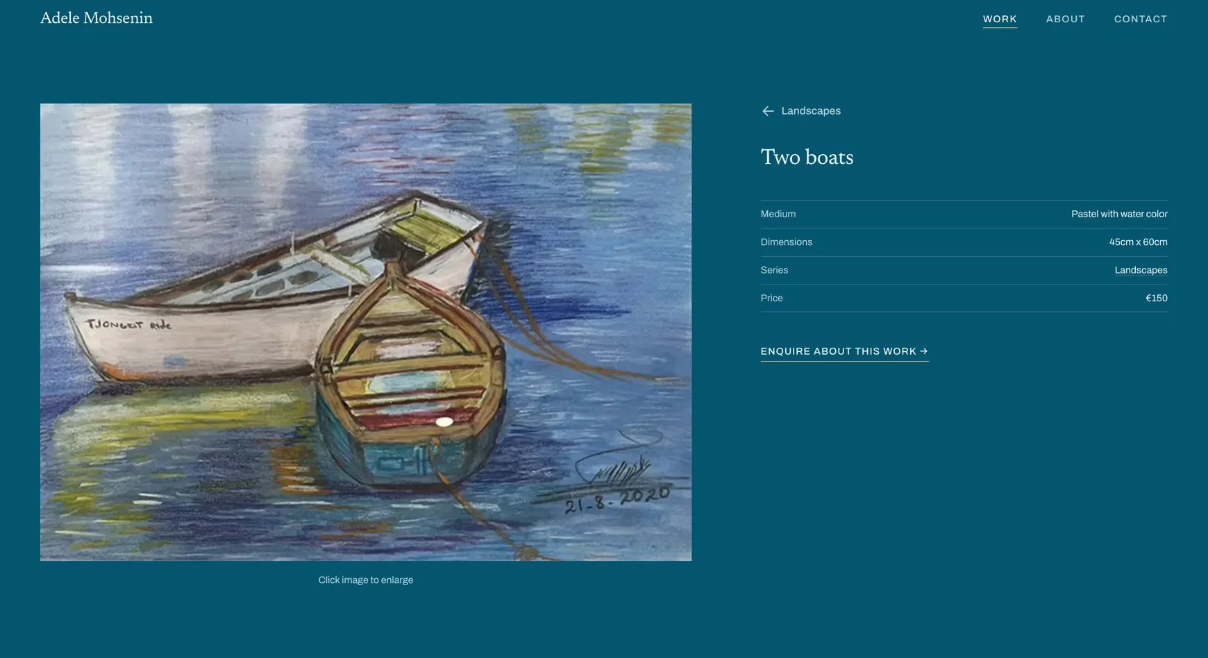
My first client was an artist paying too much for a Webflow site she couldn’t update herself. Every change meant hiring a developer. She wanted to reorganise her work into distinct bodies with their own categories, and every step of that was going to cost her.
I built the Collection template around that need: categories, per-series pages, and a way to add new work herself, first through the spreadsheet and now through Saora Studio. Her site is now live, and her request shaped the third template in the catalogue.
That’s how I want Saora to grow. Real needs shape the templates, and each template is then ready for the next artist. The first site is live, and I’m talking with the next artists now.
Saora Studio: keeping the model, changing the surface
The spreadsheet did its job, but running it showed a cost I’d underestimated. It felt like a separate tool from the site it controlled: a gallery-grade website, managed from a generic grid. The model was right. The surface wasn’t.
So I kept the model and changed the surface. Saora Studio is an app for the same job, with the same works and the same fields, dressed in Saora’s own design. The rule from Decision 1 still holds: it’s a content tool, never a site builder. I think of it as the gallery’s back room. The site is the wall, and the Studio is where works are stored, labelled and priced.
The decisions that shaped it:
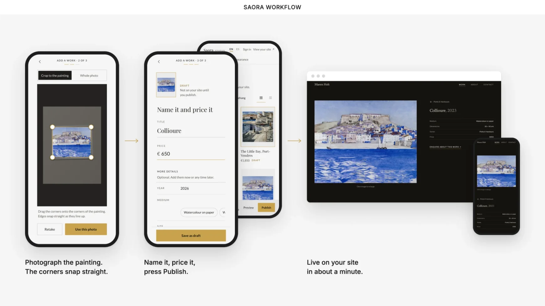
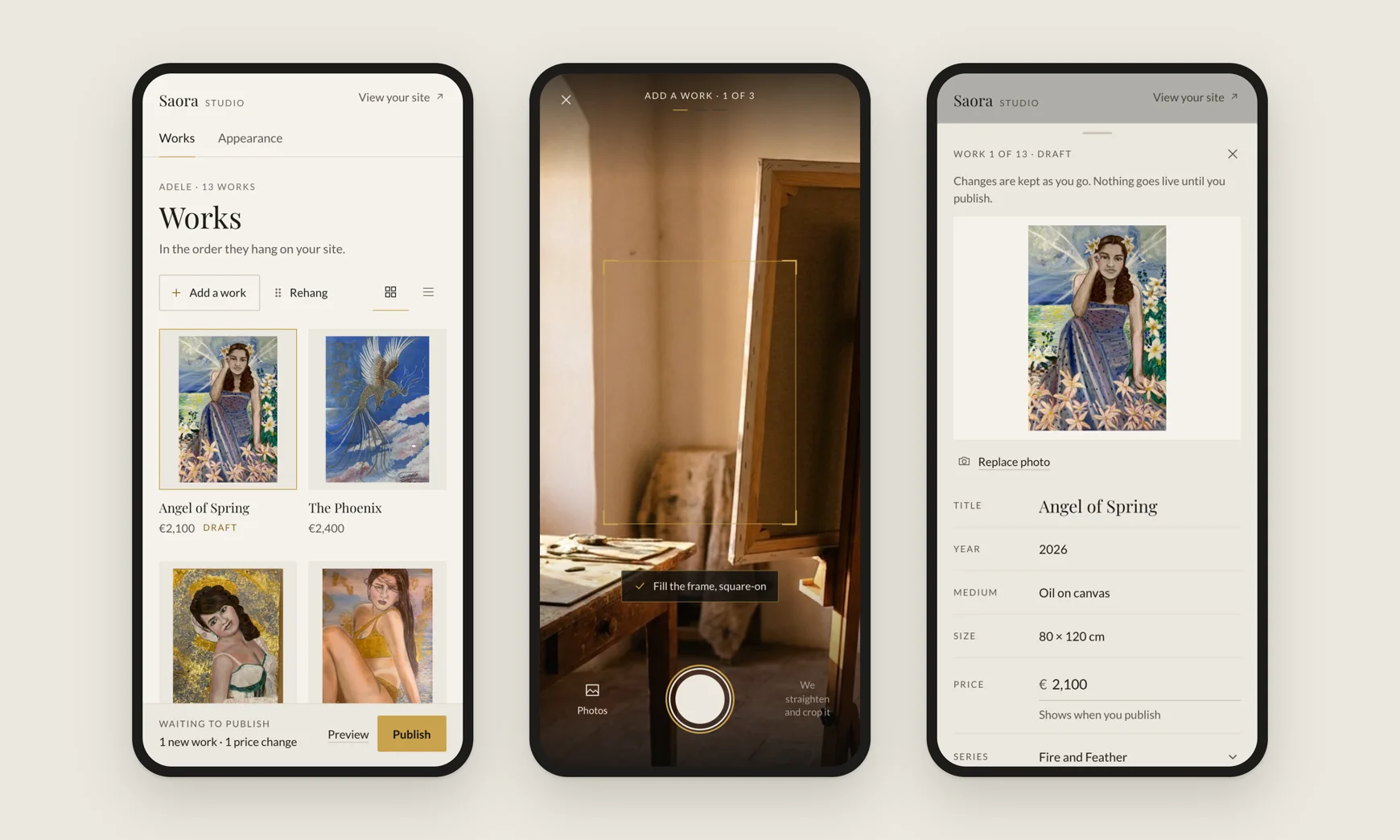
- Phone first. New work is made in the studio, not at a desk. Adding a painting starts with the camera: photograph it, check the straightened crop, give it a title and a price.
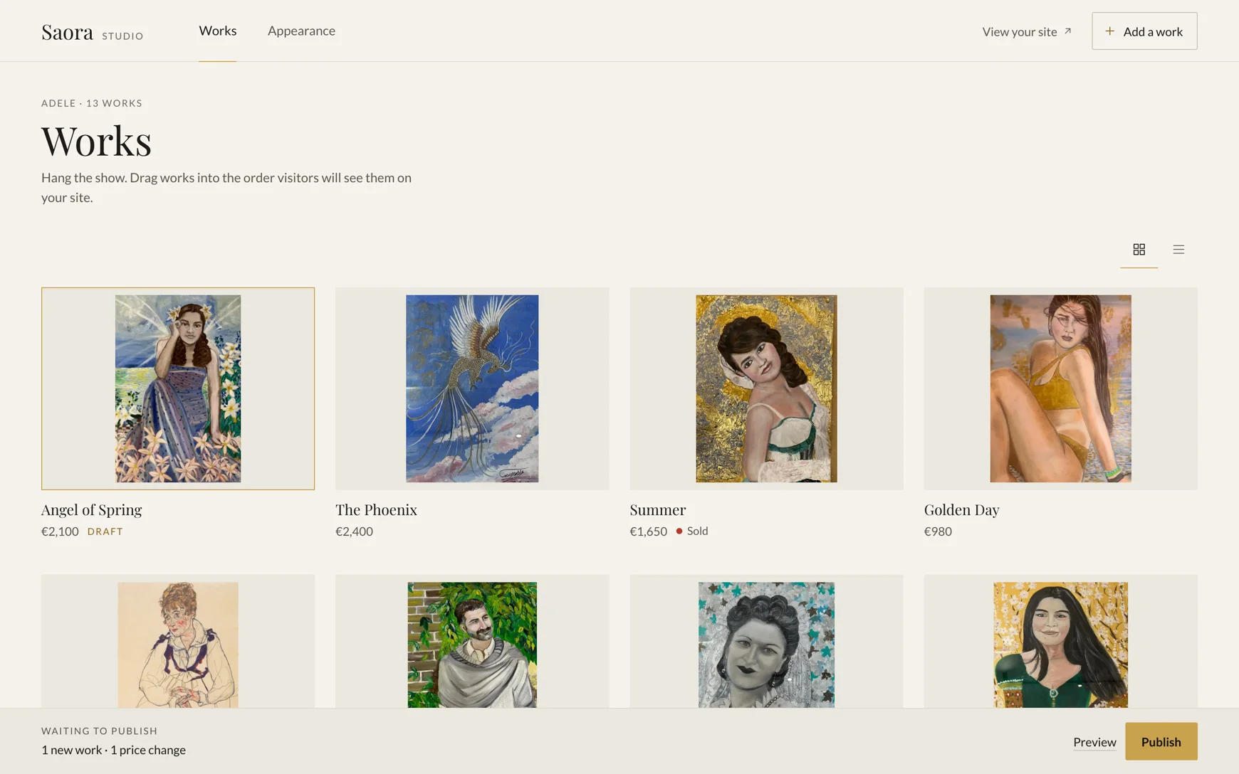
- Nothing goes live by accident. Every change waits as a draft, and the publish bar lists what will change (“1 new work, 1 price change”) before anything reaches the site. That replaces me as the person checking every update, without giving up the promise that the site can’t break.
- The artist’s words. Works, series, sold, rehang. Never posts, pages or media.
- Appearance is chosen, not designed. Artists pick from type pairings and palettes I’ve designed, previewed on their own home page. No colour picker, no font search. Bespoke looks are set up by me and shown read-only.
- A light wall. Paintings read truer on a light, neutral ground, so the whole app sits on one and the artwork is the only colour on screen.
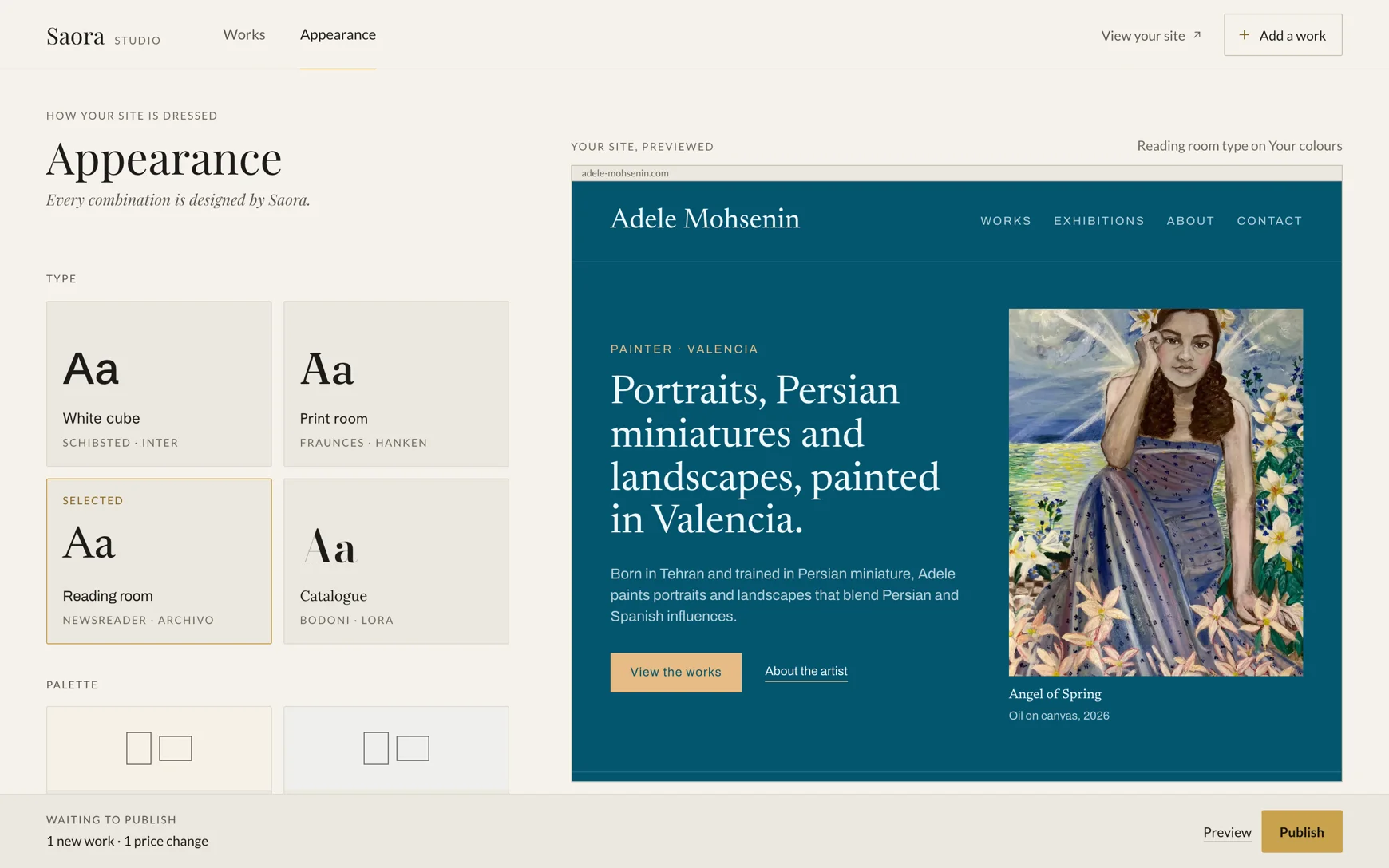
Publishing is live. Pressing Publish rebuilds the artist’s site, and the change is on the web in about a minute. The Studio is in private beta, and my first client’s site now runs on it. The promise from Decision 2 still holds: the works, photos and words are the artist’s, and they can have a full copy whenever they ask.
Try the prototype. It runs on sample data, and nothing you change there reaches a real site.
What’s next
More templates, added slowly as client needs surface them. Over time I want to expand beyond 2D work into sculpture, ceramics and other physical practices, each of which presents differently. There’s no roadmap timeline. The pace is set by demand.
I’m not trying to build a big platform. I’m trying to build the right one for a small, specific group of people, one client at a time.